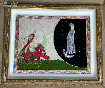
So what about the final details? As with many large projects, there were some alterations to the original "plan". I think it is vitally important to listen to the piece as you stitch it and what it needs. As I stitched this piece, my original plan had been to frame it with a double matte of gold and ivory as I have done many of my pieces. This plan just did not feel "right". It felt like a story this grand, stitched in gold and velvets and silk demanded something a bit more. In this blog post, I'll talk about the "more".
The Stitched Frame:
The stitched frame was not part of the original sketch; however, as I stitched this panel, it felt obvious to me that it needed something to quite literally frame it in a rather grand way—a way that just matting it would not be able to do. My solution was a goldwork frame. This was also influenced by my Retable Sampler that I created for the Art Institute of Chicago (based on their Burgo de Osma Retable and Altar Frontal) and the many pieces of Opus Anglicanum that I have had the privilege of studying and seeing in person. Usually, the frames in the Opus Anglicanum pieces are fairly ornate and are comprised of either intertwining branches or architectural columned archways. In many pieces in the form of an arcade of arches forming separate frames for each Saint or scene (ex- V&A #8128 to B1863). These examples felt very important as I reinterpreted this Apocalypse scene in stitch, especially as some of my reference points for the embroidery were contemporary pieces to the referenced manuscripts.
I did not want to lose the feel of the manuscripts though to the more ornate interpretations of the medieval embroidery. In the Douce Apocalypse, there are two main framing styles utilized for the illustrations. Either a simple interior color with a narrow gold outline on either side or a thinnish border of waves of two colors, usually blue and red, outlined in gold. For the folios where the Woman and the Dragon’s story unfolds, the borders are blue and red waved with gold outline (on the interior and exterior edge) with one possible exception as folio 34r looks like it may be green and red. I need to mention here that all my observation of the manuscripts have been via the digital and printed sources as I have not been able to see them in person. So it may be an exception in a green, it may be a blue that appears greenish on screen and reprinted.
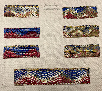
The Trinity Apocalypse has a border too but it is a very simple outline of gold. It is interesting that they balance the more decorative and patterned treatments of the background and motifs with the simple border. The use of gold makes it feel weighted to stand up to the renderings that it contains. The Douce Apocalypse with its bareness of background can withstand a slightly wider and more ornate border. I wanted to reference them both, but I could not figure out how just by sketching. I decided to stitch some samples to work out what created the best and most appropriate stitched effect. Most especially, I wanted to make sure that both the width and decoration of the border did not detract from the embroidered panel itself.
Most of the options that I explored are variations of couched gilt passing and gilt pearl purl edging. There is also some cutwork and s-ing I tried too, though those options quickly identified themselves as not the right choice for this project. The cutwork and s-ing felt too static and overly formal for this piece. Something about couching the gilt passing with the colored silks produced the level of formality needed for the composition and the impression of fluidity that kept it from feeling stodgy.
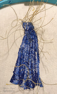
All of these samples began with one layer of felt. A couple of them also experimented with adding multiple layers of felt or soft string too. I wanted to experiment with building physical dimension versus creating implied dimension. The red is one of the reds I used in the Dragon and the blue is the mid-tone Marian blue I used in the Woman's gown.
Here I am making sure the width of the chosen frame sample felt correct with the whole composition. As you may be able to see, I adjusted the width as it felt a bit too wide.
I started with the felt. I chose to use a couple layers to create a subtle, even bevel to it. I also chose to miter all the corners instead of turning them. This you can see in the felt here, but I also mitered every corner on the couching too. More difficult? A bit, yes, but I thought visually it would look the best and I liked the challenge!
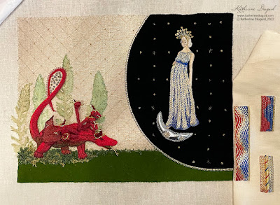
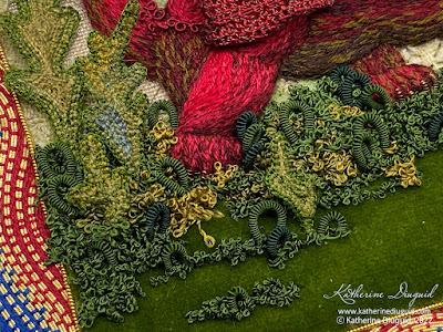
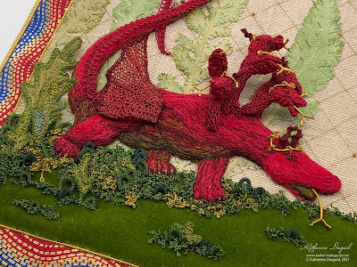
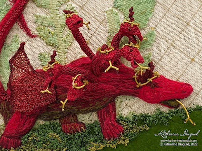
A Bit More Foliage: After the frame was complete, the ground felt a bit bare. I actually did not notice this in person but found this as I took the documentation photos. I ended up adding a bit extra foliage in the form of needlelace leaves and some silk-covered purl loops mixed in with the overtwist on the ground.
The Final Details and Frame:
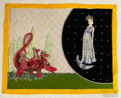
The last wonderful detail was handing it over to the wonderful framing artists at Four Corners Framing. June helped me choose a frame that matched the grandness of the story. I had mounted the piece on the double matte as taught through my RSN training. When I picked it up, June had such beautifully framed my piece that I was quite literally dancing with joy!
This piece will now be making it's way to London to be part of the Broderers' Exhibition next week (22-28 February 2022) at Bankside Gallery and then I will be proudly hanging it in my house!
Referenced Sources: (this is only a selection from my full bibliography)
A. G. Hassall and W. O. Hassall, The Douce Apocalypse: with an introduction and notes (Faber, 1961).
Belt, Shawn. “Plant Fact Sheet - Golden Ragwort.” United States Department of Agriculture Natural Resource Conservation Services, USDA, https://www.nrcs.usda.gov/Internet/FSE_PLANTMATERIALS/publications/mdpmcfs8097.pdf.
Bodleian Libraries, Bodleian Library MS. Douce 180, April 2021.
David McKitterick, Nigel J. Morgan, Ian Short, and Teresa Webber, The Trinity Apocalypse (British Library: London, 2005).
“MS. Douce 180,” Medieval Manuscripts, April 2021.
Nigel J. Morgan, The Douce Apocalypse: picturing the end of the world in the Middle Ages (Bodleian Library, 2007).
Richard K. Emmerson, Apocalypse Illuminated: the visual exegesis of revelation in medieval illustrated manuscripts (The Pennsylvania State University Press, 2018).
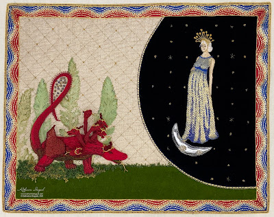
The drama of the Woman's story matches the complexity of the various interpretations of the characters and symbols present. The most common variations of the Woman view her as a representation of the Church, the Virgin Mary, the Holy Spirit, or a simultaneous combination of the Church and Mary.
Depictions of the Woman of Revelation 12 in the Douce Apocalypse
In the sequential frames depicting her story in the Douce Apocalypse, the Woman's clothes evolve as her story progresses. She first wears a red dress with blue sleeves, then a red dress hemmed with gold underneath a blue cloak, and finally, a blue dress and cloak both edged in gold. The methodical movement towards increasingly blue garments implies that it was a conscious decision and strengthens the interpretation of the Woman as a combination of both the Church and the virgin Mary. As her relationship to the Child, usually interpreted as Christ, becomes more distant, her garments morph from dominantly red, a color associated with the redemptive blood of Christ, to entirely blue, the color now associated with the Holy Mother Mary. The Sun is a symbol closely associated with Christ, and therefore, the red of her garments visibly wraps her in Christ's redemptive blood, providing salvation for believers from darkness through His death and resurrection. As her garments transition to blue, she assumes her role as the Mother of the Church; thus, she could simultaneously symbolize the Church while embodying the Holy Mother Mary.
Depictions of the Woman of Revelation 12 in the Trinity Apocalypse
The Woman's clothing as depicted in the Trinity Apocalypse also morphs. When we first see her on folio 13r, she wears a desaturated red gown with a blue robe lined in red and with a green headscarf. The Sun is very stylized and sits behind her leaving her unprotected from the Dragon (McKitterick, 54). Her halo has 12 scalloped points finished with stars. The Child wears blue as she hands him to an angel, but then wears red as he is flown to heaven.
In the next scene, we see the Woman holding her hands to caress a baby who is not present. Her halo has morphed into the traditional circular gold motif, and she wears a gown of blue with a robe of red.
Skipping to folio 14r after the War in Heaven on 13v, we see her given her wings and fleeing from the Dragon's flood as she wears a gown of blue with a robe of blue powdered with gold motifs and a white headscarf. In the next scene, she wears the same garments as she sits protected in the wilderness, a portion of the narrative only depicted in the Trinity Apocalypse (McKitterick, 54).
Inspiration for the Woman:
Viewing the Woman from a modern gaze, her interpretative complications magnify. Is her story one of redemptive foreshadowing, or does she embody the expectations imposed onto women by fundamentalist interpretations of Biblical femineity, stripping women of any individual identity separate from her familial structure and closest male association (husband/father/etc)? Additionally, the representations of good and evil as personified through the Woman and the Whore of Babylon create a stark juxtaposition of feminine stereotypes and provoke questions concerning the role of grace in redemption. The association of red with the Whore of Babylon, both as told in Revelation as well as many medieval Apocalypse manuscripts, prompts one to consider if the transition of the color of her garments is truly representative of Christ's love or murmuring to women their "path to salvation" through maternal priorities. The choice to bring life into the world is the most significant power embodied in women and envied by men. As men are physically incapable of growing or biologically nourishing life, their power lies in the taking of life rather than the giving. Could the Red Dragon also foretell of the patriarchal systems that create such starkly controlled perceptions of women? John's narrow depiction of the Woman of Revelation 12 and the fluidity of the character's meanings create a narrative rife with interpretative complications.
Stitching the Woman:
I wanted to stitch her in a way that acknowledged the range of her symbolic interpretations. I am not looking to answer questions or pronounce that I have discovered her or her story's true meaning. In fact, that very complexity and the diverse range of interpretations of her makes her so intriguing to me. I am fascinated by each of the arguments for the different interpretations. Rather than providing answers or conclusions in my piece, I want to elicit further questions--- what could she mean to us today? Does she have to mean the same thing to me as she does to you? Has her symbolism changed or stretched since the creation of the Anglo-Norman manuscripts? Where does she fit in the Biblical perception and contemporary Christian definition of womanhood? The design decisions I made to stitch her, both technical and aesthetic, will hopefully open the viewers to question these concepts rather than present a specific interpretation.
The Padding:
Traditionally, the padding would have been accomplished with felt or string. Padded characters and deep relief did not become popular until later in medieval embroidery. Opus Anglicanum techniques are quite flat, and the depth in the composition is created through the intricacy of stitch. A natural loft happens when you see the slips stitched down or when a piece uses a velvet ground, but the actual stitching is all very much on one plane. Post Reformation on continental Europe, embroidery became increasingly more dimensional with deeply padded relief. I saw the choice to pad her as an opportunity to visually imply the contemporary viewpoint to the story that I have and included in my depiction of her story.
The traditional felt and string did not feel right for this piece as I wanted to pose a contemporary question with this conceptual opportunity. I chose to use dryer lent for the padding because of its relation to the domestic and its use in feminist art to represent the domestic space that women inhabit/are confined to. I wanted to ask--are women still fighting the same fights that women fought at the time these Apocalypse manuscripts were created? These depictions of the women in Revelation, both the actual descriptions in Revelation and how they were subsequently illustrated in art, are, to say the least, disconcerting. Having been raised in a strictly fundamentalist Christian way, I deeply understand the abusiveness and hurt that these confines cultivate. Yet, I am reminded that Jesus did not treat the women surrounding him during his time on earth with the same disdain and contempt seen in many ecclesiastical and secular environments.
Since becoming a mother myself, the work of Mary Kelly has grown in personal significance. I very much felt her work after the birth of my daughter as I was also a full-time professor in a very male-dominated university. Her Post-Partum Document, created in the later 1970s, felt like an embodiment of solidarity, encouraging me in the face of blatant misogyny. Her use of compressed lint in a number of different series continues her political and social conversations. Sadly these questions feel as relevant today as they were in the 1970s and, as Christine de Pizan's writing exposes, as these ideas of womanhood were in Medieval Europe. Why isn't motherhood seen as a strength, or let's start by not counting it as a deficit?
Finished lint padding. I then added a layer of cotton muslin to protect the lint padding from the gold and make sure I did not have any lint peaking through.
Her Gown:
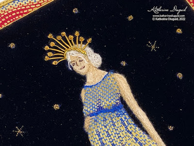
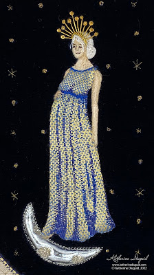
I specifically wanted a contemporary feel to the dress. I wanted the style of dress to be reminiscent of the drapiness of the medieval gowns, yet I did not want it to feel overtly medieval. I arrived at a simple, somewhat Grecian-style maternity gown. I rested her right hand on her belly to exaggerate the roundness and clearly communicate that she was still with Child.
I knew I wanted her dress to be a combination of gold and Marian blue. This saturated form of blue has become synonymous with Mary even if depictions of her in medieval art also see her wearing red and green. I chose to stitch her in a combination of gold and Marian blue. I wanted to make visual references to both interpretations that she could represent either the Church (gold) or Mary (blue) herself. This was the reason why I purposely chose not to do the couching in undersided couching or shaded bands of split stitch, which would have been more faithful to the style seen in Opus Anglicanum. The Or Nué couching such as I have stitched here is more true to later Medieval embroidery such as this Cope Hood that is part of the V&A's Collection. Notice how on this piece the Woman's bodice and overskirt are stitched in primarily colored silk in a bricking pattern with the shadows stitched in Or Nué.
Couching the passing down using three different shades of Marian blue silk. Here you can see the layer of muslin I stitched down to protect the dryer lint padding from the padding.
Couching complete and starting to plunge the ends to the back.
Ends plunged to back and ready to be tied down. You can see the different blues much more clearly on the back and I love the stitch pattern created.
All ends plunged and tied back.
I used tiny rows of silk split stitch for her face and arms to be more true to the Opus Anglicanum references. I used a combination of silk split stitch and single silver-plated passing couched for her hair. Several characters are depicted with this style of hair on the Burgo de Osma Retable and Altar Front at the Art Institute of Chicago, and it is a way of representing hair that I think is beautiful. I chose white for her hair to tie her to the Son of Man as described in Revelation 1: 13-18 .
Completed Woman ready to be appliquéd to velvet.
Halo or Crown?:
In the Douce Apocalypse, the presence of a golden halo that contains 12 stars, as mentioned in Revelation 12:1, lends credence to the interpretation that the maker of the Douce Apocalypse was projecting the identity of Mary onto the Woman of Revelation 12. The Trinity Apocalypse's scalloped halo with stars was an interesting interpretation that broke with the more common gold circular motif used for halos. Common interpretations of the 12 stars include their symbolizing the 12 apostles, the 12 tribes of Israel, or the 12 Zodiac signs. Christine de Pizan's less common interpretation, and a connection described by Bonaventure, was that the 12 stars represented the 12 joys of Paradise (Kennedy, 284), foretelling of the joys to come after the Last Judgement.
This creates an interpretation inclusive of the 12 tribes and 12 apostles as Revelation 21 tells of the "12 gates guarded by 12 angels. And the name of the 12 tribes of Israel written on the gates… The wall of the city had 12 foundation stones, and on them were written the names of the 12 apostles of the Lamb" (Revelation 21: 12-14, NLT). Additionally, the interpretation of the 12 stars of her crown foreshadowing the 12 joys of Paradise creates a connection between the Woman of Revelation 12 and the Bride of Christ of Revelation 21. It encourages a focus on the redemptive power of Christ and the glory to come for believers in the New Jerusalem. This connection also implies the Woman as the New Eve and further illustrates the grace and redemption of God (Le Frois 1958, 94).
When stitching the Woman, I gave her a halo of 12 stars. The radial pattern reflects the halo of the Douce Apocalypse, while the spiked stars reflect the scalloped points of the halo of the Trinity Apocalypse. In reading her story in Revelation and the various interpretations of her, it felt essential to have precisely 12 stars represented. To flatten them into a solid halo felt like a loss of part of her story. I have stitched her halo of stars in gilt cutwork and s-ing with gilt spangles and chipping providing the finishing touch.
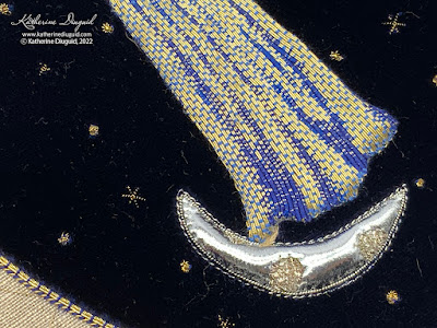
Finally, I added a silver crescent moon padded with felt and stitched with kid leather appliqué, pearl purl outline, and chipping. Her silk split stitched foot barely peaks below her gown to step upon the moon.
A Note About Inspirations
Because this was a contemporary view of this story and these inspirations from my viewpoint, I did not feel that I had to remain wholly true to one specific historic style. So, though I reference Opus Anglicanum and later medieval embroidery, I did not feel like I had to choose between them. In the same way that my view of this story is affected by countless influences throughout my life, and yours will be different because of your influences, the technical inspirations are a blend of various medieval European ecclesiastical embroidery styles. The purpose of this project was not historical recreation. It is a historically-inspired interpretation.
More soon :)
A few excellent talks:
Excellent talk by Canon Jeremy Haselock for the Churches Conservation Trust.
Mary Kelly in Conversation with Hans Ulrich Obrist for Tate Talks
Referenced Sources: (this is only a selection from my full bibliography)
A. G. Hassall and W. O. Hassall, The Douce Apocalypse: with an introduction and notes (Faber, 1961).
Belt, Shawn. “Plant Fact Sheet - Golden Ragwort.” United States Department of Agriculture Natural Resource Conservation Services, USDA, https://www.nrcs.usda.gov/Internet/FSE_PLANTMATERIALS/publications/mdpmcfs8097.pdf.
Bodleian Libraries, Bodleian Library MS. Douce 180, April 2021.
David McKitterick, Nigel J. Morgan, Ian Short, and Teresa Webber, The Trinity Apocalypse (British Library: London, 2005).
“MS. Douce 180,” Medieval Manuscripts, April 2021.
Nigel J. Morgan, The Douce Apocalypse: picturing the end of the world in the Middle Ages (Bodleian Library, 2007).
Richard K. Emmerson, Apocalypse Illuminated: the visual exegesis of revelation in medieval illustrated manuscripts (The Pennsylvania State University Press, 2018).
My newest weed (though technically an invasive wildflower) is my Cornflower.
It is based off of some photos of cornflowers that I took last spring around Iredell County, NC. The cornflowers in one of the fields along the road was just absolutely beautiful. The tiny touches of the bluish purple popping through the greens I find very lovely. It was also really interesting to see how they aged as they were the most saturated in color right after blooming and slowly turned almost white.
This will be my newest kit that I submit to teach! It is a beginner level contemporary goldwork kit. I used cotton embroidery flosses from Weeks Dye Works and a silk embroidery floss from Valdani on a 40 count linen ground.
It is interesting that as I read about cornflowers, I found out that the
state of North Carolina actually prohibits the planting of cornflowers
(though since I can find the seeds I'm going to assume it's not terribly
enforced). This small tidbit has really captured my attention and I
want to learn more about weeds v. invasive wildflowers.
For the longest time I avoided counted thread techniques. I don't know if I was afraid of their constraints or what it was. I totally underestimated how much fun they are. My intense attention to detail loves the constraints of these techniques. It is so much fun having the patterns and then figuring out how to manipulate them. When I did my RSN Canvaswork piece, I fell in love with the texture of the counted technique and the larger scale of the stitches and threads used.
For this module, we had to do samples experimenting with blackwork, pattern darning and canvaswork techniques.
Blackwork Lily:
Ground: linen
Threads: silk 6-strand embroidery floss, super fine silk
I'm pretty happy with this piece. I still need to work on getting my shading better but for the first try at a motif, I was pretty happy. It's only about 5"x7". I think I would like to try this again but at a larger scale to allow more room for shading.
After finishing my RSN Certificate, I was looking for a new challenge and I was hessitant to jump into the RSN Diploma (right now). I regularly follow Kathy Andrew's blog The Unbroken Thread and saw she was starting the City and Guilds course through Stitchbusiness. I had talked about this option with Tracy before I had started my RSN Certificate but I decided to do the Certificate instead. Now, it seems like the right time for City and Guilds.
Around Thanksgiving, I received my acceptance and have been working on samples slowly. I have to admit that I love sampling so this is right up my alley and I am finding all the sampling very gratifying. The hardest part is the fact that I want to keep experimenting with each technique. I am looking forward to working through all these assignments and having a great reference notebook afterwards. I am super excited about the mix of traditional technique and contemporary interpretation.
For the first module, we focused on fabric manipulation. Here's a selection of some of the samples that I have created. I have done a whole range of techniques including tucks, pleats, fraying, quliting, layering and slashing. One of the constraints I've given myself on this course is that I am trying (successfully so far) to not purchase any new materials and force myself to use up some of the odd bits in my stash.
Fraying:
Fabrics: I mixed strips of lots of different scraps. They included some funnky metallics, gold silk tissue and natural silks.
Stuffing:
Ground fabric: silk habatai that I tea stained
Thread: Valdani Sewing and Quilting thread 35 wt.
Note about the tea staining: I have tea stained a lot, however none of the different teas that I have tried have given such a beautiful rust-like color and such a nice and clear marbling effect on the fabric. The tea is from a small tea tin from Betty's in York that they give you after you have Afternoon Tea there. Last summer I had tea there with a few of my wonderful stitching friends from York and saved the tea for a special time. You will be seeing lots more of this soon as I loved it so much that I dyed a how range of different fabrics with it. Also- it tastes wonderful too so I wouldn't use it all to stain materials!
Suffolk Puffs or Yo-Yo's: these are stitched to ground fabric with needlelace filling for the centers and a sprinkling of whipped wheels, picots and french knots
Ground Fabric: cotton muslin
Thread: Valdani Sewing and Quilting thread 35 wt.
I decided it would be interesting to use my design from my RSN Certificate Goldwork to work samples in each technique. These are the first ones I've completed.
Here are a few small experimental pieces I finished recently. I am using the motif of a small single clover and mixing goldwork and other embroidery techniques. I'm hoping to do a little grouping of these clovers and am pretty excited the intuitive freedom that I'm giving myself to try different combinations of techniques in these.
They are a small size, which provides its own trickiness. I am just playing with combining different techniques. All are on the 18 count Aida rustico. I am purposely using this Aida rustico fabric for its contrast to the goldwork techniques (I feel like it's a "weedy" fabric). All the metal threads are still castoffs--using my weeds to stitch weeds! These will be mounted in the same kind of small metal Victorian frames as my White Clover.
Mini Clover 2: Cross stitch with metal cutwork and stretched metal s-ing
I really loved mixing the cross stitch with the goldwork but it kind of feels a bit disjointed to me as is. I think it's a good first trial run of the technique mixing but I have some other ideas I want to try to see if I can refine or challenge it a bit more. I thought the solid metal cutwork would be an interesting combination with the cross stitch since I thought it would complement the graphic quality of the cross stitch well. I am very bothered by the flatness of the cross stitch though so would like to experiment with padding it up next time or something to blend the height difference of the techniques more.
Mini Clover 3: Silk shading with 1 strand but mixing cotton floss with silk floss (you can very subtly see the difference in shine), stretched cutwork, stem stitch and bullion knots using metal threads
Stitching the 1 strand of cotton next to the 1 strand of silk was actually really interesting. They are slightly different widths and have a slightly different coverage feel to them too. I ripped each leaf out numerous times because it seemed to get a bit ropey, overworked or dimpled on me. Just need more practice I think. The texture difference was really something I liked a lot though.
I think the blossom is a bit boring. I used some leftover silver passing to do some bullion knots and they just didn't mix with the cut work like I wanted them to. I try adding in some bullion knots using the Silke Gilt Twist and I think that helped but I'm just not terribly excited or annoyed by it. Happy I tried it but want to try something a bit more adventurous I think :)!
I've started a new piece, Penland On a Foggy Morning. I'm using a photograph that I took at Penland last fall when walking to class from my cottage. I digitally printed the image on linen canvas. Then I layered it with a piece of silk gauze that I "dyed" using an eco-transferring technique with marigolds from Penland. On the bottom third of the composition where the area in the image is covered in moss and ferns, I have gone in and removed areas of warp or weft in the silk gauze and moved some of the warp and wefts around to graduate the opacity. I wanted to play around with changing the transparency of the gauze and trying to capture the fog through the fluffier silk threads of the gauze and how the tension changes as you stitch it. By moving the remaining threads around after I removed surrounding ones, it created a really interesting texture and reduced the visible grainlines of the gauze.
For the stitching, I am only using basic stitches--straight, chain and back stitch. I'm focusing on color mixing and really trying to use my stitches in a looser and more expressive way. The threads are all Valdani variegated quilting threads so they have a nice sheen to them. I cannot quite figure out if I like the quilting thread or the embroidery floss better for thread mixing. I love the sheen of the quilting thread and it seems to sit on the fabric more proudly. However, the embroidery floss blends a bit smoother as the strands stick together more and work more cohesively together. The jury is still out and I think it may just be a situation where one is better for some projects and the other is better for the rest. It is definitely something that I'm wanting to test more.
I will be adding in some metals and lots more stitches so this piece is just in progress!
Before any stitching or fabric manipulation. Here you can see the imprints from the marigold eco-transfer and I've overdyed it with a tea stain so it's not too white.
These are some of the colors I'm using and the stitching so far.