Pages

Showing posts with label frpd grant. Show all posts

Monday, January 16, 2017

Purple to Gold Canvaswork Sampler: finished!

I started this sampler as part of my Color Interactions Illuminated in Goldwork Embroidery Faculty Research Grant that I was awarded last year.  I finally was able to finish the last couple squares over Christmas.  I was exploring the effect of stitch pattern on color and investigating the question, "Is gold the complement of purple?".  

For the top 4 rows, each square is a different canvaswork stitch pattern worked in a gradient from gold to purple.  The rows are in a gradient of Anchor purples (the Anchor color choices were much nicer than the DMC purples).  The last column is all Upright Gobelin stitch to compare the same stitch pattern in the different purples.  The last two rows are simultaneous contrast samples referencing Josef Albers color explorations.  


I stitched this sampler on 18 count mono canvas with cotton Anchor embroidery floss and DMC metallic embroidery floss.   Each square is a 1" square. 


Wednesday, September 7, 2016

New Color Sampler

For the course I taught at Penland, I had the students use basic stitches and focus on color mixing by using multiple threads in their needle at the same time.  I ended up stitching this inchy sampler while I was there while I demonstrated the basic stitches.  It ended up being very relaxing finishing it up in the evenings and it showed the effect of mixing complementary colors.  Overall, it was pretty fun to stitch this sampler and compare the different rows and stitches to each other.

I used Appletons wool on linen twill.  Bottom line is 1 strand of purple, next row up is 1 strand purple + 1 strand yellow, 3rd row up is 2 strands purple + 1 strand yellow and top row is 3 strands purple + 1 strand yellow.  The stitches are all basic:  bullion knots, straight stitch, running stitch and stem stitch, chain stitch, cross stitch and french knots.


Sunday, April 10, 2016

Prepping to Stitch and a Note on Kits

The past couple days, I have been prepping to finish up my RSN Canvaswork piece and the canvaswork gradient sampler for my FRPD grant.  I've been organizing baggies of the different thread mixtures so that I can sit down and just stitch and make progress a wee bit quicker.  It also allows me to continue making progress when I need something a bit mindless to do (unlike the stitching) and allows me to know what I need to order to make sure that I'm not missing any threads to finish the pieces up-- that really stinks when you run out of a thread and are super close to finishing!  I thought I would just share a couple photos of how I organize my threads.    

Baggies for my color samples.  These baggies are then put in a larger bag that is labeled with the primary purple color number.


Through my courses with Tracy and the RSN, I have not only learned a lot about embroidery and stitching technique.  I have also learned a lot about best practices for stitching efficiently.  When you are participating in an intensive course, you have 8 days of class over 2 weeks, which means you want to try to figure out as many ways as possible to make the most of that classroom time.   Last summer, I found that I could prep my threads at night, allowing me to focus on the actual stitch technique and execution during class hours.  Mixing your threads is usually way more time consuming than the actual stitching with canvaswork.  It is also a lot less time consuming to prep multiple sets of threads at one time than to do it one at a time while stitching.  I find the start/stop of mixing as I go breaks up the rhythm of stitching too.  Finally, it also helps you feel like you're making progress a bit quicker as you can say, "Ok, all my blouse threads are ready" and then "My blouse is stitched". 

I have kept extensive notes on each color recipe for my RSN Canvaswork piece because it helps me to see how complex the design and colors are and how much work it is.  I've learned that there are a lot of steps and details that shortly after completion, my brain edits out.  For example, that white and black blouse is not just "white" and "black" embroidery floss, especially since I wanted to maintain the painterly quality of the original Vogue cover.  In general, I try to maintain a very detailed approach to my process so that if I ever wanted to look back and reference something for either myself or a student, I could.  It also keeps me open to seeing everything as a learning opportunity instead of a frustration or failure as my notes allow me to reflect on what I am doing. 
Above is my baggie of threads for the blouse on my RSN Canvaswork piece.  An example of the thread color recipes:  the "white" stripes in the blouse is actually composed of 7 strands of DMC Blanc + 1 strand of DMC 648 + 3 strands of DMC 762.

Now I know all this organizing may seem a bit overkill.  I know it is not for everyone.   But honestly I promise it helps--or at least it helps me!

Finally, a note on kits:
I've received a number of wonderful emails asking me if I will be selling my kits so I thought I would put the answer here.  Yes, I will be selling some of them but not until mid-summer, early Fall (depending on the specific kit).  When I have everything up and running to sell them, I will definitely be posting a link on here to my online shop! 

Tuesday, March 15, 2016

Purple and Gold Canvaswork Gradients

A major part of my research investigating color interactions in metal embroidery is posing the question "what is gold's complement?"  I think it is an easy thing to assume that we can substitute yellow for gold but does it really interact the same way with the other colors?  We all know that the texture and surface of a thread can change it's appearance and affect on the composition but what happens when it moves from "shiny" to "metallic"?  Is gold metallic yellow or is gold a separate color to itself? 

I thought a good start was to stitch gradients moving from purple to gold.  If yellow can substitute for gold, then purple, as the complement of yellow, should also be the complement of gold.  This means that in the gradients, we should see a desaturation of both happening as they move towards the middle of the gradient.  So, can gold desaturate or "dirty" the purple and can purple desaturate or "dirty" the gold?  Additionally, using these samples, I can address the effect of stitch pattern to color perception.  
Some of the different gradients in the different canvas stitches.  These are all 1" x 1" squares on 18 count canvas. 
I'm working the gradient by row with the last column being the same stitch- Upright Gobelin. 
Another exciting discovery in this exercise for me was learning how to do a Sorbello Stitch.  I was watching Jan Beaney and Jean Littlejohn's DVD In Stitches while I stitched these the other night and I loved what Ms. Beaney was doing with the Sorbello Stitch so much that I decided to try it out.  I LOVE this stitch!  I love the texture and I love the movement of actually executing the stitch.  Will be using this stitch a lot more in the future and I'm curious what it would look like if I used some stretched purl or passing. 

Monday, March 7, 2016

Haystacks of Giverny: Satin Stitched Color Map

After completing my Haystacks of Giverny piece, I thought it would be interesting to make a "Color Map" of all the different color combinations that I utilized in the piece.  I thought it would be interesting to show the different color combinations in equal 1/2" satin stitched squares.  This way all the variables would be somewhat controlled to allow for the color combinations to be the main focus.  I also stitched the squares of color in the order that I used the color combination on the final piece.  The first color used is the top left square and the last color stitched is the bottom right. 

All but two of the color combinations that are the plain satin stitch use 3 strands of the variegated Valdani embroidery floss.  The two that do not are a single strand of the variegated Valdani floss and were the colors used for the seed stitching in the background of the image.  For the combinations using stretched gilt purl, I stitched a 3-stranded split stitch around the edge of the square and then worked the stretched cutwork like a satin stitch with the 2 strands of Valdani plus the stretch gilt purl.  
A few important things to keep in mind when viewing this.  I purposely used the 3 strands in the same needle and purposely allowed the strands to twist as they wanted to as I worked the square.  For the squares with stretched purl, I did not use pieces of cut purl that were uniformly stretched and I allowed the pieces of cut purl to nestle together as they wished.  Now, why would I do this you may be wondering.  I also wanted to use this Color Map as an experiment to capture the quick brush strokes of the Impressionists and Post Impressionists painters that I have been studying.  They were known for their en plein air painting and speed with which they applied the paint to the canvas--not because they were being sloppy but because they wanted to capture the fleeting movement and experience of light in nature and natural settings. 
Satin stitch is the smoothest stitch you can use as it is supposed to lay nice and flat to the surface of the fabric.  This meant that in order to capture the gestural quality of the brush strokes I had to depend on the color and thread mixing not on the texture or pattern of the stitch.  
I really enjoyed stitching this Color Map and it has given me lots more ideas for future stitching.  I think was I was most excited about though was to see the range I could get utilizing only 10-11 different threads. It was also very interesting to me to see the squares with the stretched purl.  Now, just to figure out more time to stitch!

Tuesday, January 5, 2016

Haystacks of Giverny

We all hear about Monet and his haystacks--unfortunately to the point that we overlook them.  I'll be honest, I overlooked them in books.  Why is it that if an artist uses a repetitive subject matter that we do this?  There is so much to learn (I am learning) from looking at the iterations, the subtle changes from this version to the next version!  Here's just a selection of some of his Haystacks

I had never seen a Monet haystack until we went to the Musée d'Orsay.  I was completely overwhelmed with their Impressionists exhibition and the sheer size and amount of amazing pieces on display, and yet the one piece that caught my breath, that made me really pause and wonder was Monet's "Meules, fin de l'été" (Haystacks, Late Summer).  The colors, the mixtures, it GLOWED!!!!  It was the first of many Monet Haystacks I saw that trip and I cannot get enough of looking at them since we returned.

 http://www.musee-orsay.fr/en/collections/index-of-works/resultat-collection.html?no_cache=1&zoom=1&tx_damzoom_pi1[zoom]=0&tx_damzoom_pi1[xmlId]=001178&tx_damzoom_pi1[back]=en%2Fcollections%2Findex-of-works%2Fresultat-collection.html%3Fno_cache%3D1%26zsz%3D9
 
When we were at Monet's House and Gardens in Giverny, I took a ton of photos and plan on turning these photos into a new series of work integrating the color mixing principles that I am experimenting with and learning into these compositions.  This is my first finished piece.  It utilizes my photograph digitally printed on Kona cotton from Spoonflower layered with the same image digitally printed at home on silk organza with mixtures of Valdani 6-strand embroidery floss, DMC metallic floss and stretched gilt smooth purl.  

I purposely utilized a very limited number of stitch types to really challenge myself on the color mixing aspect of this piece.  Stitch types included are:  seed stitch, detached chain, bullion knot, french knot and herringbone. 
For the haystack, I have layered flat herringbone stitch in just cotton stranded Valdani, then layers of Valdani + DMC metallic floss and finally a top layer of stretched smooth purl.  Part of me wants to put some more cut purl on there but I think I need to live with the piece for a little bit first.  
For the dahilias, I had originally planned to silk shade them.  I had thought that it would be interesting to have just a bit of more realistic stitching in the composition to contrast with the more pixelated quality of the other stitches.  However as I worked the composition, I thought it would actually feel weird and not match.  I landed on using bullion knots with French knots to capture the energy of the petals in the dahilias and also to build up the texture more as the bullion knots and French knots sit higher on the piece than the detached chain stitches. 
 
  There are over 40 different color combinations from 10 different variegated Valdani threads used in this composition, referencing not only my photographs but also the color mixing that Monet used in his Haystacks.  I worked from the shadows up for the most part, though as with any project, there are always exceptions!  There is zero white and black in this piece, and the only time I have used pure color (a single color by itself) is when I have used 1 strand of floss for the seeding.  It is also interesting to note that I have bumped up the saturation of the the floss colors in the highlights and shadows. 
 Finally, I purposely did not use a hoop to allow for the fabrics to twist and bunch in areas and allow the different layers of the digitally printed images to shift.  I'm excited to start the next one!

Tuesday, October 6, 2015

France: Day 2 Giverny and Monet's Gardens


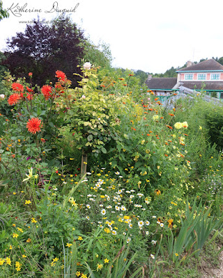
I love gardens.  I love flowers.  I love the colors, the textures, the fragrance.  I love the relaxed pace that a garden gives me--that I forget time and focus on the tiny details of the buds about to bloom and the bugs crawling around.  So I set out to Giverny to see Monet's actual gardens.  I wanted to see the lighting he saw.  I wanted to immerse myself in his environment.  So, how different were his gardens to his paintings?  As the focus of the Impressionists was to capture the true essence of light, I thought experiencing "Monet's light" was an important part of the process of evaluating the colors in his paintings.   
 
The greatest part of the day in Giverny was the fact that the weather changed.  It started sunny, clouds moved in and it got chilly and overcast, then the sun came out and washed the clouds away bright as could be.  All these changes happened as I made my way through the gardens.  I took my time, leisurely walking through the gardens enjoying the scenery and taking copious amounts of photos, trying to soak in every detail I could and capturing the overall scene, different viewpoints and details. 

I have tried to pick my “favorite” photos from Monet’s Gardens, but trying to do that is like trying to pick just a couple macarons to eat at Laudree or Fortnum and Mason—when looking at your options your automatic answer is “I’ll take them all, thank you!” but your brain knows that you cannot actually eat the whole counter of them (or pay!).  In the same way, I would love to show you all my photos I took but alas I have had to heavily edit down which ones I share!


It was so interesting to watch how the color of the flowers changed as the clouds rolled in.  The highlights disappearing and the overall contrast from highlight to color to shadow mellowing. 


As the sun came back out, you can see the harder highlights that it gave to the flowers.  It was interesting to see which flowers popped during the different weather conditions and when photographing them (whether among other plants, against the sky or water). 
You cannot go to Monet's gardens and not pay attention to the water lilies. 


The water was so still the whole time and it was exciting to see the reflections in the water adapt to the changing weather. 
The sun had just popped out and everything looked like it had a "top coating" of sun just on the top edges of everything.
Clouds moving back in ....


I love taking photos of moss and with the interesting twisting and looping of the branch, I could not resist capturing this moss!


Haystacks (not the actual ones Monet painted)!