Pages

Tuesday, December 12, 2017

NC Museum of Art: Designer in Residence This Fall!

I currently have the exciting opportunity to be a Designer in Residence for the "Inspiring Beauty:  50 Years of Ebony Fashion Fair" at the North Carolina Museum of Art during the running of the exhibition from 28 October 2017- 21 January 2018.  My colleague, Precious Lovell, is the other Designer in Residence. 

What will we be doing as Designers in Residence?
On the weekends and for special events (Members Mondays, College Night, etc), one of us will be inside the Designer Studio in the exhibition working.  We are each designing and creating a piece in response to the exhibition that utilizes hand dressmaking and embroidery skills.  Our time in the Designer Studio will allow visitors to see some of the techniques used to create the garments that the exhibition so beautifully displays.
 
CLICK here for video about Kat by the NC Museum of Art

What will my piece be?
Through this Designer in Residence, I wanted to highlight the work of the African American fashion designer, Ann Lowe.  Ms. Lowe created beautiful evening and social gowns for high society women starting in Montgomery, Alabama and moving her way up to a studio on Madison Avenue.  Her clientele included the highest of American society of the mid-20th Century including the Post's, the Vanderbilt's, the Auchincloss' and the Dupont's.  Sadly few people have heard of Ms. Lowe and her beautiful gowns, many incorporating exquisite handmade flower and embroidery embellishments. 
NY Post:  Why Jackie Kennedy's Dress Designer Was Fashion's Best Kept Secret
For this project, I will be taking inspiration from the piece that introduced me to Ann Lowe’s work—the gown that she created for Jacqueline Bouvier for her marriage to John F. Kennedy.  Growing up with a love for all things fashion, especially bridalwear, Jackie Kennedy’s gown was always one of my favorites.  Sadly though, little was written about the designer and maker.  Many articles left out Ms. Lowe’s name all together or only described her as a “colored woman dressmaker” or “negro dressmaker”.
Jackie Kennedy’s Wedding to JFK
Vogue:  "Everything You Ever Wanted to Know About Jackie Kennedy's Wedding to JFK" with a slideshow of photos
Though Ms. Lowe does not have a piece in this exhibition, she is an integral part of fashion history and was an inspiring African American designer who should not be forgotten.  In reflecting about Mrs. Eunice Johnson's goal of Ebony Fashion Fair, to empower African American women through fashion, I felt that Ann Lowe was a beautiful example of this goal.  She was empowered both by wearing her beautiful fashions, as were her clients, and she was empowered by making fashion. 
Ann Lowe from Ebony December 1966

Resources About the Inspiring Beauty Exhibition:
Website for the Exhibition
NPR:  The Ebony Fashion Fair:  Changing History on the Catwalk  (great article, photo and audio!)

Resources About Ann Lowe:
Margaret Powell's Blog about Ann Lowe
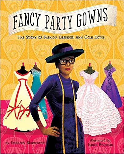
Fancy Party Gowns:  The Story of Fashion Designer Ann Cole Lowe children's book
Here's the Amazon link
Examples of Ann Lowe's Gowns:
At the Metropolitan Museum of Art
At the National Museum of African American History & Culture

More to come on my piece soon! 
 

Sunday, July 30, 2017

A Single Cornflower

My newest weed (though technically an invasive wildflower) is my Cornflower. 
 
It is based off of some photos of cornflowers that I took last spring around Iredell County, NC.  The cornflowers in one of the fields along the road was just absolutely beautiful.  The tiny touches of the bluish purple popping through the greens I find very lovely.  It was also really interesting to see how they aged as they were the most saturated in color right after blooming and slowly turned almost white. 

This will be my newest kit that I submit to teach!  It is a beginner level contemporary goldwork kit.  I used cotton embroidery flosses from Weeks Dye Works and a silk embroidery floss from Valdani on a 40 count linen ground.


It is interesting that as I read about cornflowers, I found out that the state of North Carolina actually prohibits the planting of cornflowers (though since I can find the seeds I'm going to assume it's not terribly enforced).  This small tidbit has really captured my attention and I want to learn more about weeds v. invasive wildflowers. 

Monday, July 24, 2017

Experimental Canvaswork Lily of the Valley : 2 New Pieces

For part of my City and Guilds course, I needed to complete an experimental canvaswork piece.  I decided that I wanted to see how metal threads reacted when stitched using canvas ground fabric and canvaswork stitch patterns.  I ended up doing two of these instead of one for a couple reasons.  Originally, I was going to do the first piece with much more experimental techniques on the floral motif.  However, as I started stitching the piece I became more interested in the idea of challenging the stitch pattern with naturalistic shading.  Could I get the shading to override the geometry of the stitch pattern?  After I finished that piece, I felt that it was not experimental enough to turn in for that module so I decided to go back to my trusty trial motif and execute it with the metal materials.  Again, sticking with the traditional stitch patterns and allowing the materials to illustrate the different concepts being explored. 

My first piece (which is now off to be displayed as part of the Small Works: SDA at 40 exhibition): 
At my old house I had a wonderful garden that I planted as stress relief from my corporate America job.  I always had something in bloom and it felt so wonderful to get dirty and nurture the plants that I then ended up photographing, sketching and finally stitching.  It is a very intimate process I think when you grow the plants that then lend inspiration.  I had a wonderful patch of Lily of the Valley that I planted around the time I got married that I continually studied as they are my favorite!  This was actually a design from some of the observatory photography that I did for my RSN Silk Shading piece.  I have always loved the odd angle that I took this photograph and the fact that though it is recognizably lily of the valley it lacks the delicacy that most lily of the valley motifs posses. 
I began this piece by goldleafing the background.  I thought it would be interesting to turn this photograph into an icon of the flower I love so much.  I was thinking a lot of the Byzantine icons and the ecclesiastical embroidery that I love so much.  Why should gold only be used for saints in this way?  I was originally going to go back and lightly stitch the background with 1 strand of cotton to give it a similar feel as that repeat like you see on copes.  However, I decided against that in the end as it felt a bit too busy and I had a deadline for the SDA exhibition.  I think I will probably do this in another piece in the future as I think the idea does have some potential.  
For the canvas stitching on this piece I wanted to translate the naturalistic shading like you see in silk shading but through canvas stitches.  I thought it would be really interesting as upclose the piece feels very different as the shadow of the stitch pattern highlights the geometric nature of the stitch patterns.  While from a distance, the stitch pattern is lost and the shading of the thread colors becomes the focus.I used a mixture of cotton and silk flosses. 

The second piece was another iteration of the same Lily of the Valley design that I've been using for to experiment with for other techniques:
I painted the entire canvas on this piece.  The main background has been goldleafed and then stitched with 1 strand of cotton.  The blossoms were silver-leafed and the leaves were painted with color concentrate pigments.  
All the stitching on the Lily of the Valley is executed with metal threads, the blossoms in 90% silver both using passing and smooth purl and the leaves and stem in gilt smooth passing.  All the stitch patterns are traditional canvaswork stitch patterns that have not been manipulated.  I wanted the change in materials to be very evident as I have also stitched this piece in fibers with canvas stitches.  

 
I have to admit that both seeing this piece while stitching and photographing this piece have proven difficult.  Between the reflections of the metals and the large open holes from the canvas and stitch pattern, this piece is a bit of a hypnotic maze to look at (especially for hours at a time!).

Tuesday, June 13, 2017

Research Trip: Stitching with Monet at the Art Institute of Chicago

Last summer I began to focus my research of Monet to his repetitions and most specifically his Grainstacks series.  This decision was in part due to my experience of seeing his Meules, fin de l'été at the Musée d'Orsay in Paris and how it glowed off the wall in their Impressionist Gallery and stole my attention from everything else.  In this series, it is interesting to see how he has broken up time and rendered the same motif(s) in such numerous iterations.  This idea of an artistic series like this was quiet a novel idea for the time, unlike today where artists fairly regularly will address a similar motif and topic in a series format.  

By choosing a simplified landscape and the fairly simplistic shape of a Grainstack, Monet focused his attention to capturing the color and experience of light and atmosphere and removed narrative as an artistic element.  Removing this narrative was important, as that forced the viewers to be seduced into these snapshots of time, experiencing the subtle changes of light and color of each moment of day and season.  As the field with grainstacks was located right behind his house in Giverny, it was easily accessible and very familiar to Monet, allowing the subtle details of the changing light to be evident to him. 

In the Art Institute:
On Wednesday, after my time in the Textiles Collection, I visited the Impressionists Gallery to view the 5 Grainstacks that they have on public view.  I had arranged with the European Painting department to have time to stitch before the museum opened on Thursday and Friday so this time on Wednesday afternoon allowed for some preparatory observation of color and photographing the paintings.  

I chose to focus on studying Monet's Stack of Wheat (Thaw, Sunset),1890/91, (Art Institute of Chicago, gift of Mr. and Mrs. Daniel C. Searle, 1983.166).  Why this one you may be wondering?  Honestly I chose to focus on this one as it had 1 grainstack, a fairly abstracted background and colors that I found both interesting and challenging.  There was a nice mix of smooth gradation in the sky with more textural optical mixing in the ground. 

 Materials: 
I contemplated a number of different approaches to this.  I landed on 18 count monocanvas with cotton embroidery floss.  I chose specifically to use cotton embroidery flosses (from Weeks Dye Works and Valdani) as they have a fairly dull sheen or matte finish.  Monet and most of the Impressionists chose not to varnish their paintings so their paintings do not have a glossy finish to them and are fairly matte in appearance.  I thought since he made that conscience sheen decision that it was important to match it with a thread that also had a matte finish to it.  

I have also deliberately decided to utilize all variegated thread colors.  This was a decision that was the result of all the square samples I have stitched the past few years.  Solid colors do not blend as well together and can many times result in a stripey appearance.  The variegated colors blend beautifully together and create a more painterly result.  It is also a good challenge that I cannot fully control where the variegation lands on the piece so there is a natural spontaneity and looseness that results. 

Just a side note on the floss:  The Weeks Dye Works cottons have a really beautiful sheen to them, almost like a semi-gloss.  The Valdani cottons are very matte.  I am assuming there is a difference in finishing processing, though I have absolutely no clue - just my guess.  Why is this important?  Well, it makes a difference when mixing your colors and it makes a difference within the composition.  The shinier flosses come forward visually and can jump up in dominance within both the thread mixture and overall composition.  If you are cognizant of it, you can use this to your advantage when stitching pieces. Sometimes the shine can make a thread read lighter than it actually is and sometimes it can reflect the surrounding colors. 
Now to the Stitching!:
 On the first day of stitching, I focused primarily on getting the colors to match.  After photographing the painting and creating a number of different sketches that recorded notes on composition and brush stroke direction, I started mixing my threads.  I only had 1.5 hrs. each morning before the museum opened to stitch so I had to be very deliberate about my time.  The Art Institute of Chicago has an amazing online publication on their Monet collection, Monet: Paintings and Drawings at the Art Institute of ChicagoI knew that the hardest aspect to do from a distance would be to match the colors as digital and printed colors are never the same as what they are in person with the actual painting.  Brushstroke direction and overall composition were something that I could reference from their online publication.  Color was the trickiest part and therefore had to command the use of my time.
I decided to stitch the color mixtures like paint swatches instead of my normal grid of squares. The "paint swatches" are created with 8-9 strands mixed together.  I have recorded each color recipe on a matching map in my sketchbook (it looks a little bit like a crazy mind map!).  Each color mixture is stitched twice--once with cross-hatched or overlapping stitches and once with a smooth diagonal satin stitch.  I thought it was important to record and compare the same thread combination with different textures.  It is very interesting to me the difference that just the stitch direction and type makes on the perceived color.  It's not dramatic but it is a noticeable difference and one that needs intentional observation.  On Day 1, I focused on the colors in the sky and on Day 2, I focused on the colors in the grainstack.  These were the two areas that were the hardest to see "true to color" in photographs or from digital or print resources.  They were also the anchor areas in that the sky had the highest value colors and the haystack had the lowest value colors in the composition.

On Day 2, I used the last part of my time to stitch quick directional stitches that matched Monet's brushstroke directions.  I did these stitches in the highlight or key colors of each section.  On the canvas, I am using two different techniques.  The paint swatches are 8-9 strands mixed together in the needle.  The stitching on the composition is stitched with 1 strand at a time but utilizing the same mixture of colors that are in the paint swatches.  I intend to stitch this composition both ways to compare the finished results both for final appearance and speed.  
Overall, the experience of stitching a Monet while looking at the actual painting was an unimaginable treat.  While talking to my Dad on the phone while walking back to my hotel, he asked me what made the Monet's so special.  All I could say is that it couldn't be verbalized.  You have to see a Monet to understand.  The most beautifully printed books still pale in comparison.  The greatest digital resource still feels flat.  But standing in the middle of a gallery with 5 Stacks of Grain, a few scenes from London (Charing Cross Bridge, Houses of Parliament), a couple scenes from Vétheuil, and a few Waterlilies, that experience cannot be distilled into a few sentences or descriptive words. 

Many, many thanks to Devon from the European Painting department for arranging this stitching time up for me and to Isaac in the Textiles department for connecting me with Devon and arranging the time in the Textiles collection. 

Stack of Wheat (Thaw, Sunset), 1890/91, Claude Monet, Art Institute of Chicago, Gift of Mr. and Mrs. Daniel C. Searle, 1983.166.


Selection of Resources and Further Reading:
Brettell, Richard R. "Monet's Haystacks Reconsidered." Art Institute of Chicago Museum Studies 11.1 (1984): 4-21. JSTOR [JSTOR]. Web.
Callen, Anthea. Techniques of the Impressionists. Secaucus, NJ: Chartwell, 1982. Print. 
Holmes, Caroline. Monet at Giverny. Woodbridge, Suffolk: Garden Art, 2011. Print.
Shaw, Jill. "Cats. 27–33. Stacks of Wheat, 1890/91." Monet Paintings and Drawings at the Art Institute of Chicago. Art Institute of Chicago, n.d. Web. May-June 2016.
Schaefer, Iris, Caroline Von. Saint-George, and Katja Lewerentz. Painting Light: The Hidden Techniques of the Impressionists. Milano: Skira, 2009. Print. 
Smith, Paul. Impressionism: Beneath the Surface. New York: Harry N. Abrams, 1995. Print.
Thomson, Belinda. Impressionism: Origins, Practice, Reception. New York, NY: Thames & Hudson, 2000. Print.
Wildenstein, Daniel. Monet, the Triumph of Impressionism. Köln: Taschen, 2015. Print.

Monday, June 12, 2017

Research Trip: Textiles Department at the Art Institute of Chicago

Last week I had the amazing opportunity to take a research trip to the Art Institute of Chicago.  It was an amazing 3 days and I am now trying to reflect and process all I saw and studied.  I already am hoping to go back again!

I met Isaac Facio (in the Art Institute Textiles Department) at the TSA Conference in Savannah when I presented my research poster.  He graciously offered to coordinate a visit for me to see some of their pieces in the textiles collection and connected me with the European Paintings department to arrange some stitching time with Monet.  If you are interested in weaving, I highly recommend looking at Isaac's website for his research, The Fabric of the Universe, combining 3-d weaving techniques and astrophysics.

At the Art Institute Day 1: 
I spent the first part of the day with the Textiles Deparment and Isaac.  They had pulled a number of pieces of stumpwork and ecclesiastical embroidery for me to study.  I've put the links to of a couple of the pieces that I was able to view below.  In addition to the embroideries I studied, I was able to look at 2 tapestries as well that incorporated a good bit of metallic threads in them.  I was excited that they had left these pieces out for me as I have been interested in extending my research into comparing the color interactions in embroidery to those in tapestries since my trip to France a couple years ago and reading some of Michel Eugène Chevreul's writings on color theory.

http://www.artic.edu/aic/collections/citi/images/standard/WebLarge/WebImg_000345/272604_4083226.jpg
Opus Anglicanum Fragment, 1400-1450, Art Institute of Chicago, Grace R. Smith Textile Endowment, 1995.385
English Opus Anglicanum Panel, 1995.385
I have to say I was particularly taken by this Opus Anglicanum piece and kept coming back to it and taking more detailed photos.  The split stitch was just stunning and tiny, tiny, tiny.  The color in person of the threads was really well preserved and there was a rich example of different techniques in this "small" piece.  It allowed for some wonderful study of the shading techniques.

It was interesting to observe how the metals and the stitched techniques were blended on this piece.  For example, Christ's hair and beard were rendered in stripes of modeled split stitch in yellow and green, a technique often seen in Opus Anglicanum.  Mary's hair, however, is rendered in stripes of yellow split stitch alternating with stripes of couched passing with a yellow couching thread.  Both faces and crowns were stitched in similar fashion allowing the difference in hair rendering to be both subtle (due to the repetition of yellow used) and easily comparable due to the anchors of similar surrounding techniques.  Observing from a small distance, it created a slight visual bounce and lightness (or feminine quality) to Mary's hair while Christ's hair was much more static feeling. 

This piece also offered a wealth of opportunities to study colored threads interacting with metals.  The background was created with areas of metal passing couched with red to create an interesting diamond pattern that changed in scale inside each connected area.  The bottoms of the columns had areas of red and blue couching and areas of colored laid work with a trellis of metal over the top.  The garments, rendered in modeled bands of split stitch, had a scattered pattern of metal crosses formed with couched passing and tips of metal purl and metal twists and passing trims. 

http://www.artic.edu/aic/collections/citi/images/standard/WebLarge/WebImg_000003/46707_361252.jpg
Picture Depicting the Queen of Sheba before King Solormon, 1601-1650, Art Institute of Chicago, Gift of Mrs. Laurance H. Armour, Sr. in memory of her mother, Mrs. Henry Malcolm Withers, 1962.773
Stumpwork Picture Depicting the Queen of Sheba before King Solomon, 1962.773
This piece of stumpwork had some really incredible sculptural qualities and some wonderful trims on the character's garments.  Specifically, there was a hammered metal trim that I have seen before in little details but not in this quantity of use.  These garments were really covered in metals including the hammered trim, spangles, purls, and smooth passing. I kept imaging how "blingy" it must have been before the metals had tarnished!

The way the crowns on the King and Queen were created was also very interesting as it mixed smooth purl with sead pearls in a looping technique that made the crown both pop off the surface and poses a kind of electric, mangled quality that created an overall charming feeling.

The scale of people to composition of this piece was also interesting.  There were 2 buildings in the background and a couple floral and fauna motifs, however the characters, due to their size and intricacy of detailing, were by far the stars of this panel and commanded the viewers attention.  In most of the stumpwork panels I have seen, the size of the people is not quite so dominant. 

http://www.artic.edu/aic/collections/citi/images/standard/WebLarge/WebImg_000151/3403_1616981.jpg
Casket Depicting Scenes from the Old Testament, 1668, Art Institute of Chicago, Restricted gift of Mrs. Chauncey B. Borland and Mrs. Edwin A. Seipp, 1959.337
Stumpwork Casket Depicting Scenes from the Old Testament, 1959.337
This casket was huge and had tons of different techniques (especially needlelaces) on it.  It was so intricate and honestly so much fun to look at! One of my favorite techniques in stumpwork (and I know this is an odd one) is how the shadows of the needlelace flowers and butterflies are stitched in a matching satin stitch behind the needlelace.  This casket was covered in examples of this on the flowers, leaves and butterflies.

Another technique that I paid particular attention to was the use of pistol stitch (a french knot at the end of a long straight stitch done simultaneously) in some of the leaves.  It was noteworthy in the density of use and the banded shading that it was used for.  It is interesting to me that the banded shading was still used in a technique that could have easily not been banded.  With the needlelace, couched colored purls and satin stitch, I understand the use of banded shading is much easier/kind of the default required as it would be very difficult to have multiple needles going.  With the pistol stitch I think it is interesting that this visual banding is maintained as it would not have been difficult to swap out needles.  Same goes for the areas of cut colored purl, I wonder why they chose to align the cut bits in linear color formation.  This is something that I have seen a number of times in my different research trips and that I have been pondering for a while and this large casket has rekindled this curiosity in my mind.
http://www.artic.edu/aic/collections/citi/images/standard/WebLarge/WebImg_000360/289794_4279492.jpg
Retable (Depicting Madonna and Child, Nativity, and Adoration of the Magi; Altar Frontal Depicting the Resurrection and Six Apostles), c. 1468, Art Institute of Chicago, Gift of Mrs. Chauncey McCormick and Mrs. Richard Ely Danielson, 1927.1779a-b
Spain, El Burgo de Osma Retable, 1927.1779a-b
This piece is on public view inside the Medieval Gallery.  Just a note if you want to go see it, it is only lit for 5 minutes at the top and half of each hour.  And yes, if you are wondering, I totally stalked it and returned multiple times to the point that the security guard finally came up to me and asked if I was a researcher and what I was looking at!  Thankfully the day I stalked it, the museum was fairly quiet and not too crowded.  The Thursday and Friday I was there, the museum was very packed, so just a note for future viewing!

Isaac also sent me the link to this video about this piece as it was just recently conserved:  The Retable from Chicago .  The video offers some great detail shots, so I highly recommend watching it!

Further links of Interest:
I also met Dr. Erica Warren, Assistant Curator in the Textiles Department, who will be speaking on Embroidery and the Arts and Crafts Movement at the International Embroidery Conference presented by the EGA in Chicago next spring. 


Thursday, June 1, 2017

City & Guilds: Counted Thread

For the longest time I avoided counted thread techniques.  I don't know if I was afraid of their constraints or what it was.  I totally underestimated how much fun they are.  My intense attention to detail loves the constraints of these techniques.  It is so much fun having the patterns and then figuring out how to manipulate them.  When I did my RSN Canvaswork piece, I fell in love with the texture of the counted technique and the larger scale of the stitches and threads used. 

For this module, we had to do samples experimenting with blackwork, pattern darning and canvaswork techniques. 
 Blackwork Lily: 
Ground: linen
Threads:  silk 6-strand embroidery floss, super fine silk
I'm pretty happy with this piece.  I still need to work on getting my shading better but for the first try at a motif, I was pretty happy.   It's only about 5"x7".  I think I would like to try this again but at a larger scale to allow more room for shading. 

 Contemporary Pattern Darning
Ground fabric:  burlap
Leaves:  ribbon, yarn, wool roving, silk floss, gimp
Buds:  lace hem tape, ribbon, metallic + white braiding, baking twine, gilt smooth passing + ostrich feathers
Stem:  ribbon

Canvaswork Sampler:
Ground fabric: 14 count canvas
Blue Straight Stitches:  threads used include cotton, silk, rayon, wool and 
Yellow Cross Stitches:  threads used include
Red Diagonal Stitches:  threads used include cotton, silk, rayon, wool and

Wednesday, May 31, 2017

City & Guilds: My Newest Adventure

After finishing my RSN Certificate, I was looking for a new challenge and I was hessitant to jump into the RSN Diploma (right now). I regularly follow Kathy Andrew's blog The Unbroken Thread and saw she was starting the City and Guilds course through Stitchbusiness.  I had talked about this option with Tracy before I had started my RSN Certificate but I decided to do the Certificate instead.  Now, it seems like the right time for City and Guilds.  

Around Thanksgiving, I received my acceptance and have been working on samples slowly.  I have to admit that I love sampling so this is right up my alley and I am finding all the sampling very gratifying.  The hardest part is the fact that I want to keep experimenting with each technique.  I am looking forward to working through all these assignments and having a great reference notebook afterwards.  I am super excited about the mix of traditional technique and contemporary interpretation. 

For the first module, we focused on fabric manipulation.  Here's a selection of some of the samples that I have created.  I have done a whole range of techniques including tucks, pleats, fraying, quliting, layering and slashing.  One of the constraints I've given myself on this course is that I am trying (successfully so far) to not purchase any new materials and force myself to use up some of the odd bits in my stash.  

 Fraying:
Fabrics:  I mixed strips of lots of different scraps.  They included some funnky metallics, gold silk tissue and natural silks.  

 Stuffing: 
Ground fabric:  silk habatai that I tea stained
Thread:  Valdani Sewing and Quilting thread 35 wt. 
Note about the tea staining:  I have tea stained a lot, however none of the different teas that I have tried have given such a beautiful rust-like color and such a nice and clear marbling effect on the fabric.  The tea is from a small tea tin from Betty's in York that they give you after you have Afternoon Tea there.  Last summer I had tea there with a few of my wonderful stitching friends from York and saved the tea for a special time.  You will be seeing lots more of this soon as I loved it so much that I dyed a how range of different fabrics with it.  Also- it tastes wonderful too so I wouldn't use it all to stain materials!

Suffolk Puffs or Yo-Yo's: these are stitched to ground fabric with needlelace filling for the centers and a sprinkling of whipped wheels, picots and french knots
Ground Fabric:  cotton muslin
Thread:   Valdani Sewing and Quilting thread 35 wt.

I decided it would be interesting to use my design from my RSN Certificate Goldwork to work samples in each technique.   These are the first ones I've completed. 
Traditional English Quilting with running stitch.
Ground fabric:  cotton osnaburg
Threads:   Weeks Dye Works cotton embroidery floss

 Italian Corded Quilting and Trapunto
Ground fabric:  silk dupioni
Thread:  Valdani Sewing and Quilting thread 35 wt.


Tuesday, April 25, 2017

A New Mini Clover

I've been working on a number of these so more to come shortly!  My goal is to have at least 20 of them if not more.  They all fit into 2"x3" Victorian metal frames.  They are all pretty similar (and in some cases the exact same) size as actual clover that I've picked and dried from my yard. 
I'm experimenting with different techniques and materials.  I want the group of them to work from very traditional stitching to non-traditional collage-stitching.

Here is the latest finished one:
 Details:  Valdani 6-strand cotton flosses on 18 count cotton Aida cloth.  Cross-stitch leaves with a stretched gilt pearl purl outline and stem.  Blossom is composed of bullion knots in natural silk floss and Gilt Sylke Twist.


Tuesday, March 28, 2017

Penland On a Foggy Morning: finished !

I'm shipping it off tomorrow for the Penland School of Crafts Annual Benefit Auction.  Now, I just hope it sells 😁!

Title: Penland On a Foggy Morning
Size: 5"x7"
Materials:  Digitally printed cotton, marigold (from Penland) ecotransfer on silk gauze, gilt metal purls, Gilt Sylke Twist, Valdani variegated cotton floss and metallic machine thread.
More on the process in my previous post here: Penland Process

Here are some photos of the final piece: 
  
 
Finished but not framed yet:


And a process picture:


Monday, March 20, 2017

Two Mini Clovers

Here are a few small experimental pieces I finished recently.  I am using the motif of a small single clover and mixing goldwork and other embroidery techniques.  I'm hoping to do a little grouping of these clovers and am pretty excited the intuitive freedom that I'm giving myself to try different combinations of techniques in these.  

They are a small size, which provides its own trickiness.  I am just playing with combining different techniques.  All are on the 18 count Aida rustico.  I am purposely using this Aida rustico fabric for its contrast to the goldwork techniques (I feel like it's a "weedy" fabric).  All the metal threads are still castoffs--using my weeds to stitch weeds!  These will be mounted in the same kind of small metal Victorian frames as my White Clover

 Mini Clover 2:  Cross stitch with metal cutwork and stretched metal s-ing
I really loved mixing the cross stitch with the goldwork but it kind of feels a bit disjointed to me as is.  I think it's a good first trial run of the technique mixing but I have some other ideas I want to try to see if I can refine or challenge it a bit more.   I thought the solid metal cutwork would be an interesting combination with the cross stitch since I thought it would complement the graphic quality of the cross stitch well.  I am very bothered by the flatness of the cross stitch though so would like to experiment with padding it up next time or something to blend the height difference of the techniques more.  
 Mini Clover 3:  Silk shading with 1 strand but mixing cotton floss with silk floss (you can very subtly see the difference in shine), stretched cutwork, stem stitch and bullion knots using metal threads
Stitching the 1 strand of cotton next to the 1 strand of silk was actually really interesting.  They are slightly different widths and have a slightly different coverage feel to them too.  I ripped each leaf out numerous times because it seemed to get a bit ropey, overworked or dimpled on me.  Just need more practice I think.  The texture difference was really something I liked a lot though.   
I think the blossom is a bit boring. I used some leftover silver passing to do some bullion knots and they just didn't mix with the cut work like I wanted them to.  I try adding in some bullion knots using the Silke Gilt Twist and I think that helped but I'm just not terribly excited or annoyed by it.  Happy I tried it but want to try something a bit more adventurous I think :)!

Friday, January 27, 2017

Penland On a Foggy Morning: work in progress

I've started a new piece,  Penland On a Foggy Morning.  I'm using a photograph that I took at Penland last fall when walking to class from my cottage.  I digitally printed the image on linen canvas.  Then I layered it with a piece of silk gauze that I "dyed" using an eco-transferring technique with marigolds from Penland. On the bottom third of the composition where the area in the image is covered in moss and ferns, I have gone in and removed areas of warp or weft in the silk gauze and moved some of the warp and wefts around to graduate the opacity.  I wanted to play around with changing the transparency of the gauze and trying to capture the fog through the fluffier silk threads of the gauze and how the tension changes as you stitch it.  By moving the remaining threads around after I removed surrounding ones, it created a really interesting texture and reduced the visible grainlines of the gauze.

For the stitching, I am only using basic stitches--straight, chain and back stitch.  I'm focusing on color mixing and really trying to use my stitches in a looser and more expressive way.  The threads are all Valdani variegated quilting threads so they have a nice sheen to them.  I cannot quite figure out if I like the quilting thread or the embroidery floss better for thread mixing.  I love the sheen of the quilting thread and it seems to sit on the fabric more proudly.  However, the embroidery floss blends a bit smoother as the strands stick together more and work more cohesively together.  The jury is still out and I think it may just be a situation where one is better for some projects and the other is better for the rest.  It is definitely something that I'm wanting to test more. 

I will be adding in some metals and lots more stitches so this piece is just in progress!
 Before any stitching or fabric manipulation.  Here you can see the imprints from the marigold eco-transfer and I've overdyed it with a tea stain so it's not too white.

These are some of the colors I'm using and the stitching so far.