

So what about the final details? As with many large projects, there were some alterations to the original "plan". I think it is vitally important to listen to the piece as you stitch it and what it needs. As I stitched this piece, my original plan had been to frame it with a double matte of gold and ivory as I have done many of my pieces. This plan just did not feel "right". It felt like a story this grand, stitched in gold and velvets and silk demanded something a bit more. In this blog post, I'll talk about the "more".
The Stitched Frame:
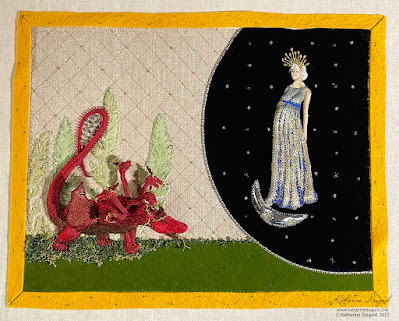
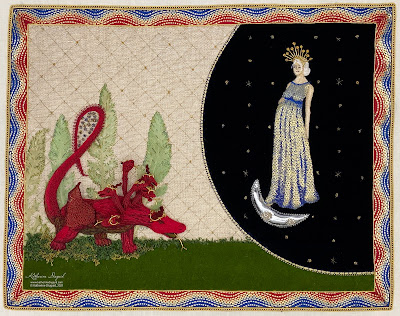
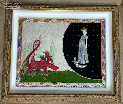
The stitched frame was not part of the original sketch; however, as I stitched this panel, it felt obvious to me that it needed something to quite literally frame it in a rather grand way—a way that just matting it would not be able to do. My solution was a goldwork frame. This was also influenced by my Retable Sampler that I created for the Art Institute of Chicago (based on their Burgo de Osma Retable and Altar Frontal) and the many pieces of Opus Anglicanum that I have had the privilege of studying and seeing in person. Usually, the frames in the Opus Anglicanum pieces are fairly ornate and are comprised of either intertwining branches or architectural columned archways. In many pieces in the form of an arcade of arches forming separate frames for each Saint or scene (ex- V&A #8128 to B1863). These examples felt very important as I reinterpreted this Apocalypse scene in stitch, especially as some of my reference points for the embroidery were contemporary pieces to the referenced manuscripts.
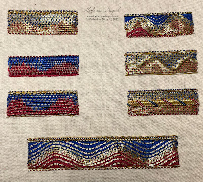
I did not want to lose the feel of the manuscripts though to the more ornate interpretations of the medieval embroidery. In the Douce Apocalypse, there are two main framing styles utilized for the illustrations. Either a simple interior color with a narrow gold outline on either side or a thinnish border of waves of two colors, usually blue and red, outlined in gold. For the folios where the Woman and the Dragon’s story unfolds, the borders are blue and red waved with gold outline (on the interior and exterior edge) with one possible exception as folio 34r looks like it may be green and red. I need to mention here that all my observation of the manuscripts have been via the digital and printed sources as I have not been able to see them in person. So it may be an exception in a green, it may be a blue that appears greenish on screen and reprinted.
The Trinity Apocalypse has a border too but it is a very simple outline of gold. It is interesting that they balance the more decorative and patterned treatments of the background and motifs with the simple border. The use of gold makes it feel weighted to stand up to the renderings that it contains. The Douce Apocalypse with its bareness of background can withstand a slightly wider and more ornate border. I wanted to reference them both, but I could not figure out how just by sketching. I decided to stitch some samples to work out what created the best and most appropriate stitched effect. Most especially, I wanted to make sure that both the width and decoration of the border did not detract from the embroidered panel itself.
 |
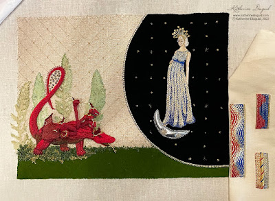
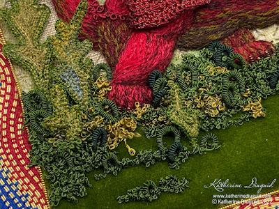
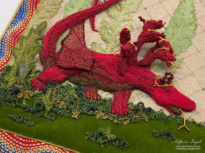
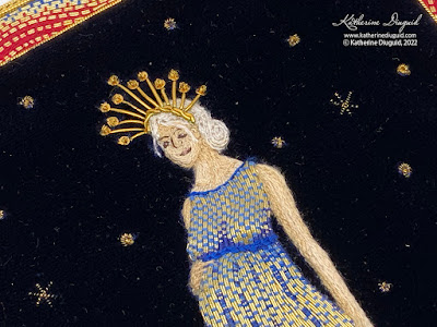
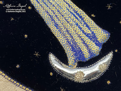
After the frame was complete, the ground felt a bit bare. I actually did not notice this in person but found this as I took the documentation photos. I ended up adding a bit extra foliage in the form of needlelace leaves and some silk-covered purl loops mixed in with the overtwist on the ground.
The last wonderful detail was handing it over to the wonderful framing artists at Four Corners Framing. June helped me choose a frame that matched the grandness of the story. I had mounted the piece on the double matte as taught through my RSN training. When I picked it up, June had such beautifully framed my piece that I was quite literally dancing with joy!
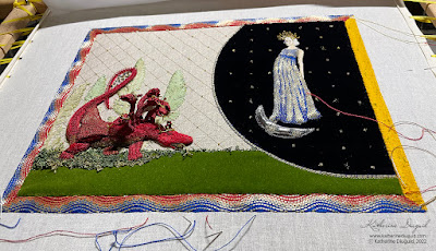
This piece will now be making it's way to London to be part of the Broderers' Exhibition next week (22-28 February 2022) at Bankside Gallery and then I will be proudly hanging it in my house!
Referenced Sources: (this is only a selection from my full bibliography)
A. G. Hassall and W. O. Hassall, The Douce Apocalypse: with an introduction and notes (Faber, 1961).
Belt, Shawn. “Plant Fact Sheet - Golden Ragwort.” United States Department of Agriculture Natural Resource Conservation Services, USDA, https://www.nrcs.usda.gov/Internet/FSE_PLANTMATERIALS/publications/mdpmcfs8097.pdf.
Bodleian Libraries, Bodleian Library MS. Douce 180, April 2021.
David McKitterick, Nigel J. Morgan, Ian Short, and Teresa Webber, The Trinity Apocalypse (British Library: London, 2005).
“MS. Douce 180,” Medieval Manuscripts, April 2021.
Nigel J. Morgan, The Douce Apocalypse: picturing the end of the world in the Middle Ages (Bodleian Library, 2007).
“Revelation 12: NLT Bible: YouVersion,” NLT Bible | YouVersion.
“Revelation 21: NLT Bible: YouVersion,” NLT Bible | YouVersion.
Richard K. Emmerson, Apocalypse Illuminated: the visual exegesis of revelation in medieval illustrated manuscripts (The Pennsylvania State University Press, 2018).
This is a very fine achievement. It's so important to listen to one's project, I agree, especially for mounting and framing. It's so easy to kill all the impact with inappropriate framing, and here you've managed to enhance the piece!
ReplyDelete