
The background of this piece was a true merge between my influences from both the Douce and Trinity Apocalypse manuscripts. Ironically, the backgrounds of both are extremely different yet they play an integral part in what drew me to these two manuscripts. In this blog post, I will summarize the aspects of each manuscript that played a key influence, and then I will discuss each part of the background on my embroidered panel and how these influences were synthesized in my piece.
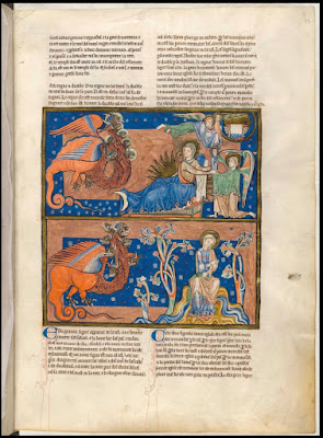 |
| Trinity Apocalypse folio 13r |
Influences from the Trinity Apocalypse:
I love the backgrounds in the Trinity Apocalypse-- how they are divided and form vignettes with the various bars and rectangles, how the colors are flipped to subtly reinforce this without creating visual noise that would distract from the figures depicted, and how the subtle patterning softens the solid spans of gold and saturated colors. All these aspects I absolutely adore about the Trinity Apocalypse. Much is written about the rendering style of the drapery, which no doubt is lovely but it is the background that captures my attention. The harshness of the geometric divisions lends a more contemporary feel, especially as the artist has flipped complementary colors, as seen in the above image of Folio 13r. If you separate the layers of the composition and image it without the imagery, the backgrounds themselves seem fairly noisy. Yet, the powdering of the tiny motifs and groupings of dots seems to provide a buffer that harmoniously joins the background layer with the imagery layer. The thin outline of gold then frames out each composition.
 |
| Douce Apocalypse folio 33v |
Influences from the Douce Apocalypse:
In looking at the Douce Apocalypse, one main aspect that I loved about how the illustrations are rendered is the blankness of the background. This is starkly contrasting to the completely colored background of the Trinity Apocalypse, but there is something about the sketchbook-like quality that this blank background creates that I love. It seems to open the door a bit more informally to the story and makes me feel like I am peaking into it as the artist is trying to sort out the story themselves. This story is wild, complicated, layered, and not an easy one to unpack.
Where the background of the Trinity Apocalypse is formed using harsher straight rectangular sectionings, the Trinity Apocalypse is abundant in its use of wavy lines and circles. The concentric wavy lines encircling the Woman on Folio 33v create visual movement and direct the viewer's attention to her while not feeling stodgy. Her crescent halo balances with the upside-down crescent moon to provide visible boundaries for the Woman and cocoon her pregnant belly, which strategically rests in the center of the concentric undulating circles. Our foremost attention is directed to her child within her belly protected by her caressing hands while presenting her in a position of high importance. The wavy lines of the landscape balanced with the wavy lines of the sky help to continue the softening of the composition. The only straight, linear elements are the border and the staff in John's hand.
Setting the Stage:
The main portion of the background on my panel is composed of metallic gold linen. I chose this fabric as it blended the reference to heaven in the gold and the reference of the redemption through Jesus' resurrection in the linen. I then added a strip of apple green velveteen to provide a base for the foliage. I chose a straight band as I wanted to include the strict geometry seen in the Trinity Apocalypse background. To further the inspiration from the Trinity Apocalypse, I use fine gilt thread to create a thin lattice pattern covering the metallic linen background. Though different from the powdered motifs of the Trinity Apocalypse, the lattice pattern maintains a similar diamond-shape to the repeat as the half-drop repeat has for the powdered motifs.

Foliage:
The depictions of the foliage were especially charming in both manuscripts. They remind me of crewelwork leaves and stems. They are not remotely naturalistic and that is precisely why I love them so much! In the Douce Apocalypse, the depiction of the foliage visually grows as the Woman’s story unfolds. When the Woman first appears, the foliage minimally anchors the composition providing John a place to sit. By the Woman’s escapes on 35r, the foliage covers almost half the background emphasizing her migration from celestial to the earthly environment. I tried to be cognizant of this as I decided how much or how little foliage to add to the panel.
For the actual foliage, I chose to appliqué silk that I had eco-printed with leaves. I loved how the color of the eco-print mimicked the variation in the color washes of the Douce Apocalypse. The leaves seemed oversize in the composition and yet are true to size biologically. It also felt right to use something created quite literally from our world using a roadside weed, Appalachian Ragwort (Packera anonyma also called Small's Ragwort), which is both a pollinator for bees and butterflies yet can be poisonous to other animals such as livestock. That duality, providing nourishment to some and toxicity to others, felt suitable for a composition depicting an Apocalyptic scene. It is also in the same family as Golden Ragwort (Packera aurea) which was used medicinally by Native Americans to treat menses, prevent pregnancy, and help childbirth (Belt).


Circle:
In the Douce Apocalypse, the circular undulating lines framed the Woman Clothed with the Sun in such a beautiful way. They represented heaven and created a womb-like protective boundary in which she resides. This protective boundary and its womb-like feel were important to me when considering how to protect her from the Dragon.
As tempted as I was to maintain the undulating movement around the circle, I felt it was important to smooth it out to give a nod to the clear geometric boundaries of the background vignettes on the Trinity Apocalypse. To soften this edge, I knew I would add some kind of goldwork edging to blur the velvet boundary into the heavenly gilt linen background. Though this crispness of edge felt like the right direction, it also created an emptiness in the velvet that seemed a bit naked when considering the influence of the Trinity Apocalypse. Granted, the emptiness of the background of the Douce Apocalypse was one of the characteristics that sparked my interest; however, velvet has a much different visual that demanded something more. This presented an interesting design dilemma, along with the edging choice, that required a bit more sampling on the side.

For the edging, I tested different variations of pearl purl outlining and s-ing with smooth purl. None of them worked. They seemed too inconsequential and created the feel of a ragged edge instead of a purposely blurred edge—not the look I desired. To be honest, I think I was over-complicating the matter. The solution I chose for the final panel was a combination of couched passing and overstretched pearl purl using a Marian blue silk thread to attach both. Sometimes simpler is better. The Marian blue broke up the gold enough that it created a nice transition that felt considered yet not flashy.
To address the nakedness of the velvet, I decided to mimic the diaper patterning present in the Trinity Apocalypse with stretched gilt smooth purl stars and small gilt spangles stitched with a Marian Blue silk thread. It was essential to sample for the stars as redoing something on the velvet would have meant redoing the velvet altogether. Anytime you take something out of velvet to redo it, bits of the pile are lost too, scarring the fabric. I tested different size gilt spangles, various attaching methods, stars created with stretched and unstretched cutwork, and purl french knots. In the end, I chose a combination of spangles and stretched purl stars, aligning them to the same grid formed from the gilt thread lattice covering the metallic linen allowing the pattern to span the surface of the background.
The next post will be about the aspect that intrigued me most about the story and within the manuscripts.... the Woman Clothed with the Sun!
Referenced Sources: (this is only a selection from my full bibliography)
A. G. Hassall and W. O. Hassall, The Douce Apocalypse: with an introduction and notes (Faber, 1961).
Belt, Shawn. “Plant Fact Sheet - Golden Ragwort.” United States Department of Agriculture Natural Resource Conservation Services, USDA, https://www.nrcs.usda.gov/Internet/FSE_PLANTMATERIALS/publications/mdpmcfs8097.pdf.
Bodleian Libraries, Bodleian Library MS. Douce 180, April 2021.
David McKitterick, Nigel J. Morgan, Ian Short, and Teresa Webber, The Trinity Apocalypse (British Library: London, 2005).
“MS. Douce 180,” Medieval Manuscripts, April 2021.
Nigel J. Morgan, The Douce Apocalypse: picturing the end of the world in the Middle Ages (Bodleian Library, 2007).
“Revelation 12: NLT Bible: YouVersion,” NLT Bible | YouVersion.
“Revelation 21: NLT Bible: YouVersion,” NLT Bible | YouVersion.
Richard K. Emmerson, Apocalypse Illuminated: the visual exegesis of revelation in medieval illustrated manuscripts (The Pennsylvania State University Press, 2018).
I love how you are building up the layers of story and reference in this piece.
ReplyDeleteAnd as I spent half an hour yesterday steaming marks out of some velvet, which won't be an option once I've worked on it - absolutely, yes, sampling is very necessary!