17th Century raised work has enjoyed a special place in my heart since I first saw photos of it in textile history books years ago. I love the dimension of the quirkily rendered characters and scenes. I find everything about them absolutely charming and cannot learn enough about the pieces, the history, and the techniques. I am very grateful to have seen many pieces of raised work in museum collections during research trips throughout the UK and USA. Their charm may have captured my attention in black and white photographs but seeing these creations in person, at scale-- it is truly something special.
A few-ish years ago, I started the Cabinets of Curiosity courses with Tricia Nguyen as I have a deep desire to embroider a casket or cabinet of my own at some point in my life. Through her courses I have learned so much and have found many other embroiderers that share a passion for raised work embroidery and a desire to stitch their own casket. It is incredible to me to see how fellow participants use and interpret the 17th Century techniques for their own designs and to see the broad range of themes that are chosen.
I have had this little wooden box in my studio since I first started the Cabinets of Curiosity courses. The course materials seemed so precious to me that I had wanted a box that was not too expensive to practice on first. I found one at a craft store and thought it would be a sample appropriate size and price point. This Spring, as I was closing in on finishing my City and Guilds Level 3 Certificate in Stitched Textiles with Tracy Franklin and Julia Tristan, I had the deep desire to cover this box for my daughter for one of my final projects. However, a mix of looming deadlines and indecisiveness about the design direction led to me creating this sample book first. You see, I wanted to tell the story of Jane Austen's Pride and Prejudice in the embroidery but I could not decide what I wanted the aesthetic feel of the piece to be. I love 17th Century raised work, however, I found myself wanting to incorporate some contemporary techniques to help create a feel that would transport me to the misty mornings of an English Countryside.
The beginning of Quarantine (as I am sure many reading will agree) was a bit stressful, full of changes coming from every direction, and filled with uncertainty. I found myself looking for a space that provided a quiet respite from everything going on around me. I started rewatching the various Jane Austen BBC miniseries adaptations while I stitched at night once everyone else in the house was fast asleep. Then, I fell down a Jane Austen rabbit hole. The beautiful writing, the happy endings, the subtle nuances of personal relationships and Regency Britain -- she provided the perfect escape. I started reading Pride and Prejudice at night before I fell asleep, listening to the audio book when I walked or stitched and continued rewatching all the different movie and BBC miniseries adaptations. It became a bit of a family joke. My very patient husband listened to my reasoning on which film version of Pride and Prejudice was "the best". Just as a personal note: my opinion still remains that the 1995 BBC miniseries of Pride and Prejudice is my favorite overall. However, the music, color, and pacing of the 2005 movie make it a very close second and I find its soundtrack playing in my head when I read and reread the book.
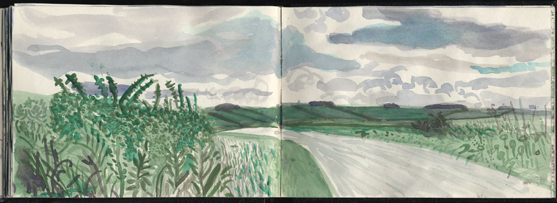
The Landscape:
I started looking at a lot of different english landscape photographs and paintings online. I finally decided upon on using photos from my friend Denny's garden outside of York as reference for the compositions. Her garden is absolutely beautiful and there has always been something so peaceful about the time I have spent there with her over the years.
I also found myself going back to David Hockney's Yorkshire Sketchbook. As I sketched and watercolored my landscapes, the question presenting itself was how detailed did I want the landscape to be on these compositions? I took a step back and relooked at Hockney's Yorkshire Sketchbook watercolors and his paintings from his exhibition A Bigger Picture at the Royal Academy of Art in London in 2012. I also started looking at Joan Eardley's landscapes. They are quite different work, but both captured the landscape in ways that intrigued me and that I thought could be interesting to interpret in stitch.
My ultimate desire for the landscape was to create that misty, romantic, quiet of an English countryside setting that the 2005 movie captures so beautifully. As I sketched, I quickly transitioned to watercolor. The first sketches were fairly detailed and as I continued to sketch, and re-sketch, and try it again, the compositions became looser and closer to the feel that I was after. I was drawn to how they both abstracted areas of the landscape and balanced the composition with specific areas of more defined detail.
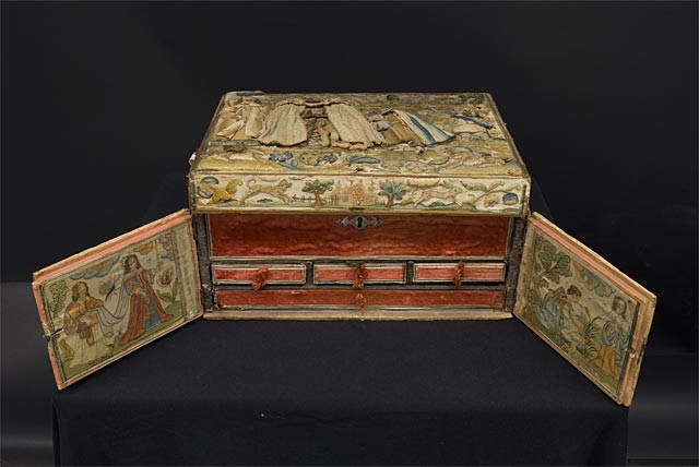
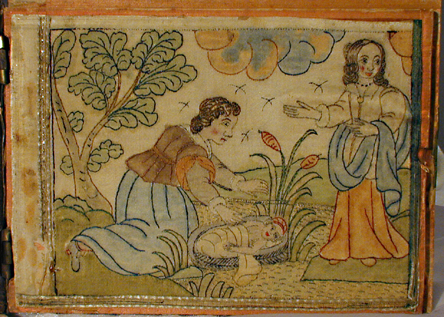
While I was watercoloring in my sketchbook, I remembered this casket that is part of the University of Albert collection. When opened, the casket reveals panels that have been painted with stitched outlines. I would love to one day see it in person! This combination of watercolor and minimal stitching was very intriguing.
I decided to try watercolors on silk and linen. On page 1 of the Sample Book, I tried different scenes watercolored on silk dupion with various levels of detail. Then on page 2, I painted the same scene using watercolors on different linens (28 count, 32 count, 40 count and a metallic linen blend). I really enjoyed painting on the silk. It was so lovely how you could build up the layers of colors. By contrast, the watercolor on the linen visibly wicked away. I should note too that two of the linens (32 and 40 count) were "raw" linen and I found that a bit dark to work on with the watercolors. The ivory of the 28 count was better, however, I still really did not enjoy how the watercolor moved on the linen.
I was not convinced in any of the painted samples, so I decided to do a set of samples with embroidered landscapes using a cotton/linen background that was digitally printed with a very loose watercolor I had done a few years ago for my Lighthouse Landscapes class (taught at EGA National Seminar in Louisville). For these samples (page 3), I also experimented with how much or how little detail to stitch.
Square 1 (top left)- most detailed, uses straight stitch, seeding and chain stitch, lots of layering in the bushy and leafy areas.
Square 2 (top right)- uses only straight stitch, any direction, but lots and lots of layers of straight stitch
Square 3 (bottom left)- completely flat, only horizontal straight stitch, no overlapping
Square 4 (bottom right)- not all flat, grass is completely flat with horizontal, non-overlapping straight stitches, hills in distance are layers of vertical straight stitch
Not convinced of the embroidered samples either, I pondered the possibilities of free motion embroidery. Page 4 shows a few samples created using solvy and free motion embroidery. The middle sample is created with many layers of just free motion (it is pretty thick, thick enough that I was concerned it would be too thick). The samples on the sides combine different combinations of silk, cotton and wool threads hand stitched in long floats onto the solvy and then lightly free motioned on top. I do not think the combination of the long hand floats and free motion are right for this project, but I will be saving this idea for future purposes!
And, still......none of the samples felt "right". I wanted something softer. Something misty. Something ethereal. Something that also would complement and not compete with the figures. I did not want lots of contrast or relief or any hard edges. I went to my scrap drawer and found strips of silk organza. I decided to watercolor over the organza and then try layering the painted strips in different ways (page 5). Layering the organza felt very organic and had the same relaxed feeling of some of the looser watercolors in my sketchbook. This felt like it was going in the direction I wanted, so I did a larger sample (page 6) and created the composition for the front cover.
As I reread Austen's description of Elizabeth visiting Pemberley, I felt that my desire for a soft background reflected Austen's approach to the landscapes that felt so important to the story but were defined so vaguely. The reader is provided with just enough detail of the landscape as is needed to create space for the drama between her characters.
The Clothing for the Characters:
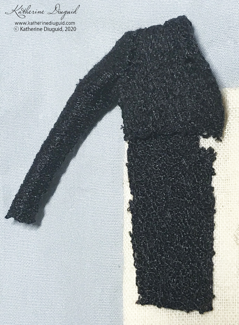
My next hurdle that I wanted to sample was the clothing for the characters. After experimenting with the free motion for the landscape samples, I thought it could be interesting to test out free motion embroidery on solvy for the clothing. I wanted to see and feel the difference between that and the hand needlelace or appliqué techniques that I have tried before.
I did a deep dive into Regency fashion and found a pattern for one of Jane Austen's silk pelisse written by Hilary Davidson and published in Costume: The Journal of the Costume Society, "Reconstructing Jane Austen's Silk Pelisse, 1812-1814" . I used this pattern for the long jacket sample and adapted it to create patterns for a spencer jacket, day dresses and a waistcoat for Mr. Darcy. For scale reference, these clothes are about the size of finger puppets.
Pages 7 and 8 of the Sample Book show the pattern and the machine free motion samples for Mr. Darcy's waistcoat (right half) and for Elizabeth Bennet, a long pelisse and a couple dress variations. Dressmaking at this scale was so much fun! It was extremely fiddly, but I was fascinated that I could still ease the sleeve into the armhole, and it was fascinating to watch the tiny pieces take shape into tiny pieces of clothing.
From these samples, I found (as I was afraid it would) that the free motion on sovly resulted in a piece that was stiffer than I wanted for the dresses and pelisse. For Mr. Darcy's waistcoat- I think it might work, but will probably choose the technique chosen for the female clothing for cohesiveness. I did try both the translucent and the mesh solvy types and neither was "perfect". On the first batch of samples, I had some skewing issues that caused the pattern to shrink up in the direction of the stitching. That issue was fixed with some patience and being very conscious to make a grid first and then, at the right speed for my machine so the correct stitch length was achieved, filling in the piece. I also made sure before putting anything together to true the stitched pieces to the pattern.
The thread that I found worked the nicest was the Sulky rayon thread. It was thinner and the final piece was drapier (see yellow above). The green is Sew All cotton wrapped polyester and the resulting pieces were noticeably thicker and stiffer.
After satisfying my questions of free motion on solvy's suitability for this project, I turned to hand needlelace. On page 9, I created a sampler of different needlelace techniques using different threads (each shade of pink is a different thread). I tried various silks by Au ver a Soie, Cotton machine thread by Valdani and Gilt Sylke Twist.
The final clothing sample on page 10 is a small handmade needlelace spencer jacket and day dress. The spencer jacket was made with Soie de Paris using a corded Brussels stitch. The day dress is made with Soie Gobelin and mixes corded Brussels stitch, double Brussels stitch, pea stitch, and Hollie point.
Final Thoughts:
Ultimately, the pieces in this book are samples, just explorations, for the small wooden trinket box that I plan to cover in embroidery for my daughter, but it felt very rewarding binding them all together in cloth book form. I purposely chose to mount the samples to the pages in a more informal way to preserve the sample quality for each exploration. I did not want them feeling "too serious". In hindsight, I am so glad that I took the time to make this sample book, and it excites me that now I have a book to go with the eventual trinket box. Creating this sample book allowed me to focus on developing alternatives and trying a few techniques that I had not tried before. It slowed me down freeing me up to further challenge myself to find the technique that I felt best suited the project not the timeline. It was a reminder of how sampling provides such a wealth of knowledge as a project develops and is invaluable when trying to sort out those tricky design questions. And, I will admit that not all of the samples created made the cut to be in the final book.
Further Looking, Reading, Listening, and Watching:
I also thought I would share some of the wonderful resources that I have found or that have been shared with me since starting this project.
An audio book of Pride and Prejudice is available for FREE via the Audible Stories website!
Kat, I so enjoyed reading this and seeing the thought processes you had for each step of this project. I especially enjoyed your comment about taking your time to experiment with various techniques and letting that guide you rather than the timeline of the project.
Thank you Sara! I love sampling but I think putting the samples in a book really made them feel special and made me look at them in a bit of a different way. I want to use this format more going forward :)
It was a real delight to read this and look at all your plans and experiments. It's always intriguing to see how other people tackle developing designs, and your casket is going to be a wonderfully multilayered affair!
An intriguing post, thank you. I for one struggle to create pieces and often give up when I see the perfection of others' work on Instagram, forgetting the as I do the long process of evolution and experimentation.


Loved this post. I don’t have the patience to chronicle my thought and work process. And thanks for the shoutout❤️
ReplyDeleteThank you Janet! Your work is soooo inspiring that I cannot help but share it.
DeleteKat, I so enjoyed reading this and seeing the thought processes you had for each step of this project. I especially enjoyed your comment about taking your time to experiment with various techniques and letting that guide you rather than the timeline of the project.
ReplyDeleteThank you Sara! I love sampling but I think putting the samples in a book really made them feel special and made me look at them in a bit of a different way. I want to use this format more going forward :)
DeleteIt was a real delight to read this and look at all your plans and experiments. It's always intriguing to see how other people tackle developing designs, and your casket is going to be a wonderfully multilayered affair!
ReplyDeleteThank you Rachel!
DeleteAn intriguing post, thank you. I for one struggle to create pieces and often give up when I see the perfection of others' work on Instagram, forgetting the as I do the long process of evolution and experimentation.
ReplyDeleteThank you, Pam! I think we all struggle with seeing other's perfect, beautiful pieces!
Delete